Showing posts with label Gerald Lazare. Show all posts

Wednesday, August 19, 2015

Postscript: From Illustrator to Painter (The Final Step, Part 1)

By Gerald Lazare

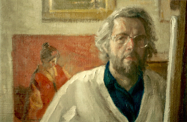
StudioSelfPortrait

The story of Artists who both illustrate and paint has a long history. Many illustrators painted and many painters illustrated. One of the 20th Century’s most famous painters, Claude Monet, was a cartoonist and illustrator before The Water Lillies and our own Jack Bush illustrated for decades before he turned to abstraction. Edward Hopper, The great American realist, was an illustrator much of his working life. There are obvious differences between the two disciplines. As an illustrator, you create images that enhance stories by writers for publishers or ads for the business world that promote companies usually, in both cases, working with art directors.


​As a painter, you tell your own story. You make pictures of what you love and what matters in your life and imagination and you do this alone, without direction from anyone else. For some artists this can be problematic. As an illustrator you are secure in a system that asks you to work for them and pays you well to do so. As a painter, you are vulnerable on your own, showing your work, hoping someone will be attracted and moved enough to want your picture.


​When I was a teenager, I discovered the work of the master painters, especially the ones who drew well: Rubens, Watteau, Ingres, Degas, Sargent and many others. They became my hallmark, my school and inspiration. When I was 25, in 1953, I went to Europe for over a year’s study of their work in the museums and earned my living there as an illustrator. When I returned and continued my freelance life as an illustrator, I dreamt of someday being a painter, painting my own pictures and subjects. When I left illustrating to paint in 1974, I was in my 40s and realized, if I didn’t begin to paint then, it would be too late.


​I had more illustration assignments than ever from both the Canadian and American markets and was winning awards in the U.S. I had no idea the future would bring a decline in illustration with the exodus of many magazines and their fiction and the rise of photography and computer technology. With the best wishes of my clients and agent in New York, I changed my course and changed my drawing board for an easel. Within two years I had my first one-man show at the Nancy Poole Gallery in Toronto.
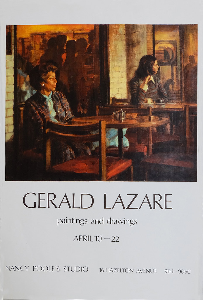
coffeetime
Gallery Show Invitation: “Coffee Break”

It nearly sold out and caught the attention of the critics.
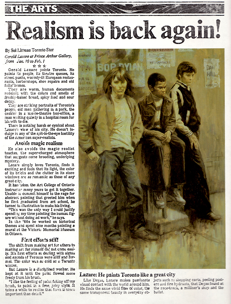
ralismisback
Gallery Show review, Toronto Star, 1976

My years of illustrating added much to my success as a painter. I had learned to compose a picture. I had learned to draw well. I had an understanding of value and colour. I had disciplined myself to work hard. The main change was subject matter… but even there, it carried over to some extent.

​I had always enjoyed doing faces and portraits and art directors would often comment on that ability. I was advised more than once to consider portrait painting as a career. I enjoyed painting the public, but I soon discovered painting your family and friends was more enjoyable.
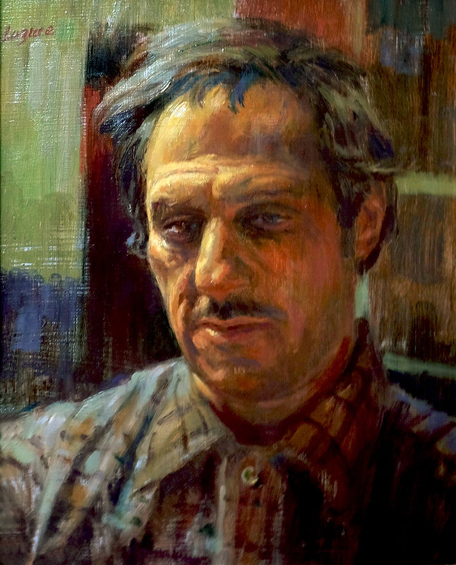
georges
Portrait of George

PortraitofDawn
Portrait of Dawn (Commissioned)

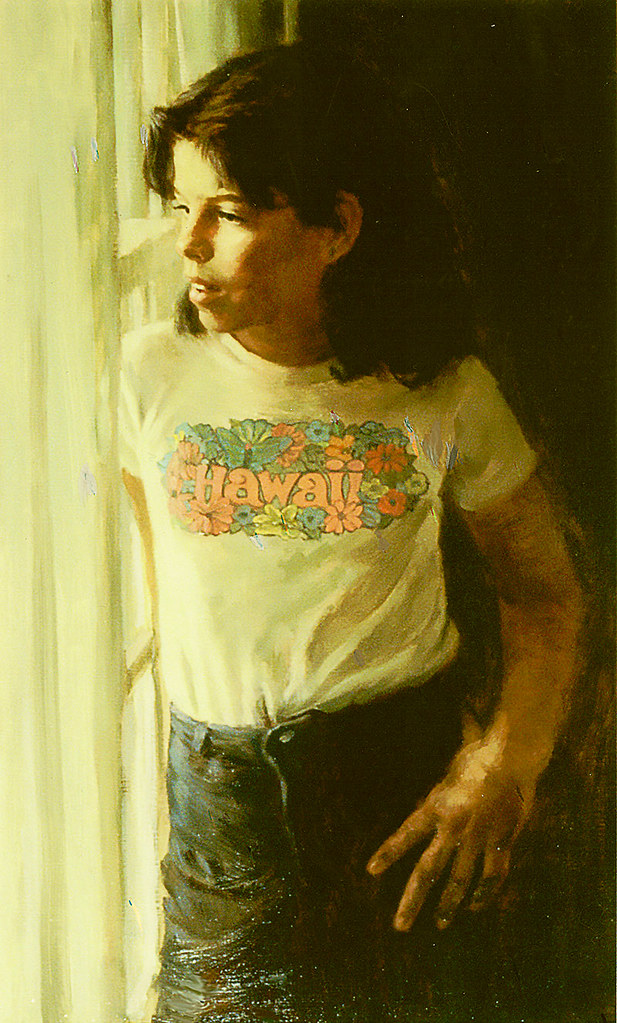
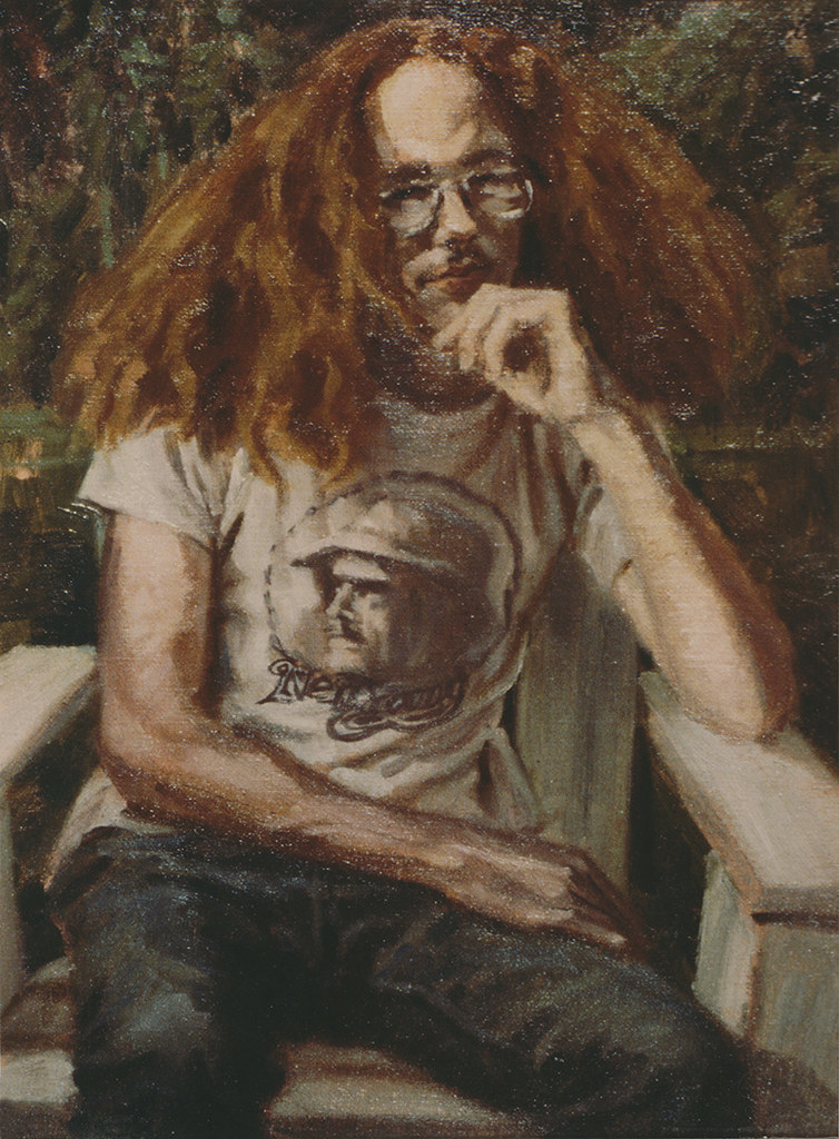
Hair
Hair (Portrait of artist’s son)

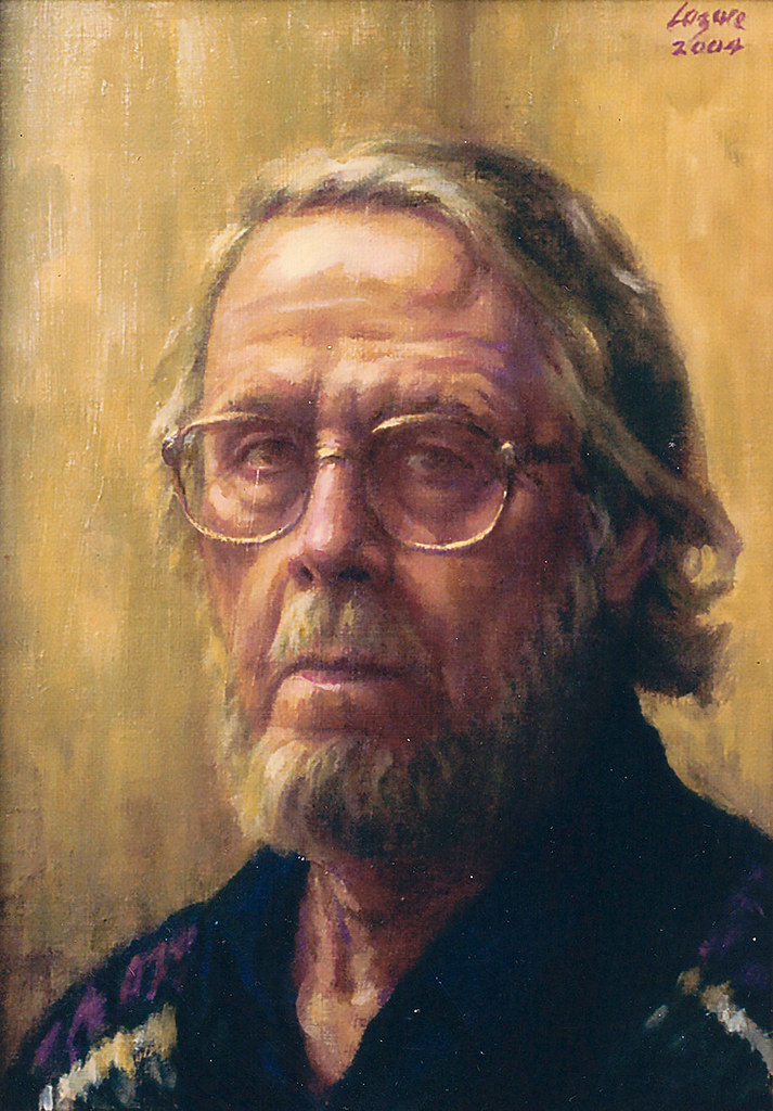
SelfPortrait
Portrait of the artist

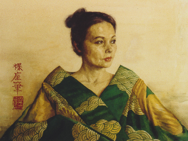
PortraitofSetsuko
Portrait of Setsuko (the artist’s wife)

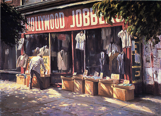
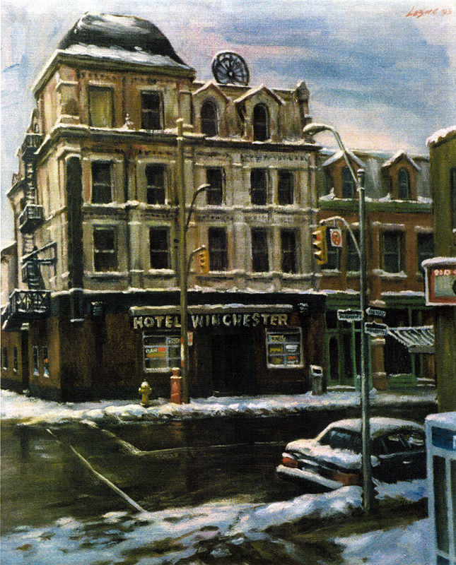
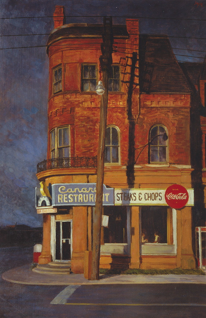
A lot of my paintings include cityscapes. The old Junction where I grew up is still etched in my soul. My parents were storekeepers and my walks to school and back passing the shops and movie theatres and what I later called “street furniture” became my early themes and awakened in me a love of architecture I hadn’t known. In 1992, The City of Toronto gave me a retrospective titled “Painting the City” and quoted me:

"Born and raised in Toronto, I have always been a lover of cities and find the human comedy is played out in infinite variety on a city stage. The way we work, play and build our shelters and giant towers to commerce presents an inexhaustible opportunity for the artistic imagination. I’m drawn to a personal view of the city… the soul of it, rather than historical documentation."
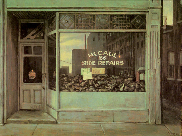
catspaw 004
Cat’s Paw

hollywoodjobbers 001
Hollywood Jobbers

WinchesterHOtel
Winchester Hotel

canaryrestaurant
The Canary Restaurant

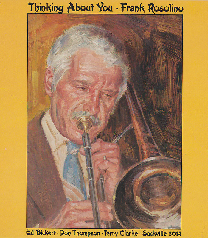
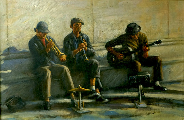
When I was in public school, I discovered the big bands and Jazz. When I was a teenager doing the comics I created Drummy Young, a crime busting band leader. As an illustrator, I did LP and CD covers for Jazz musicians.
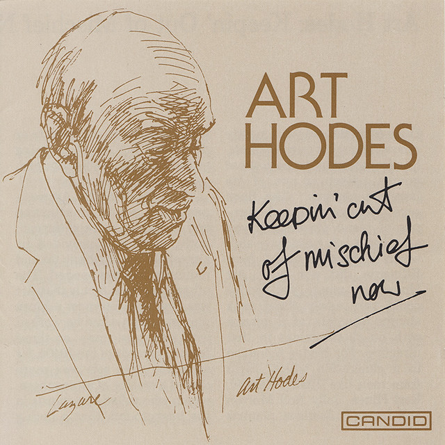
ArtHodesCDcover
Art Hodes CD

rosf
Frank Rosolino LP cover

In 1974, for my first show, I painted “Take the A train,” my homage to Duke Ellington, the famous composer and band leader who died that year. It was accepted by the Ontario Society of Artists Exhibition in 1975 and later a print was made and sold to fans and musicians all over the world. Ellington’s sophisticated music has influenced my work and like most musicians, painters are improvisers and composers too.
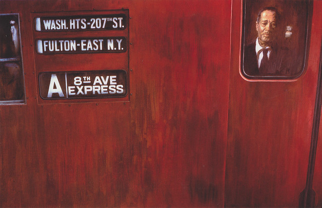
taketheatrain
Take the A Train

WashingtonSquareRag
Washington Square Rag

Live music is especially rejuvenating and I’ve spent many hours sketching in Toronto jazz clubs like The Montreal Bistro and Café du Copins ... long gone now.
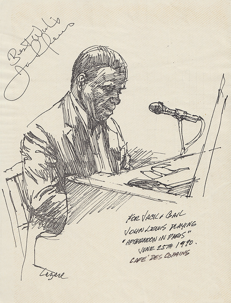
JohnLewissketch
John Lewis sketch at Café des Copains


Concluded tomorrow.

Monday, August 17, 2015

An Illustrator’s Story – Magazines and Newspapers (Part 2)

By Gerald Lazare


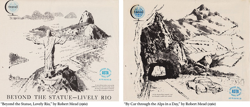
Canadian Homes Magazine had features like travel and gardening still popular features for magazines. Its art director was Art Guest, a lovely gentle man who always had time to chat. They featured a travel spread I enjoyed illustrating and here are two examples:

CanHomesMag

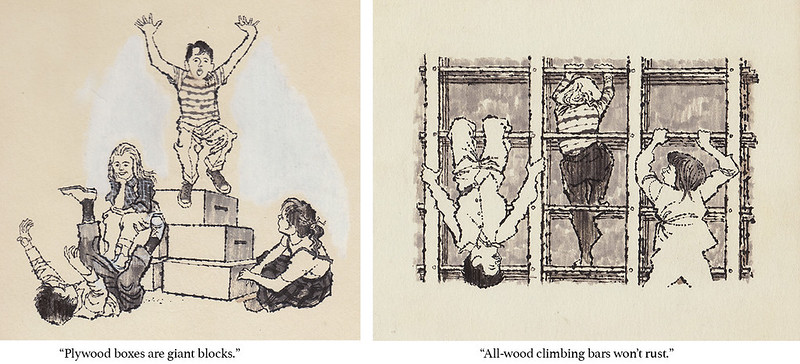
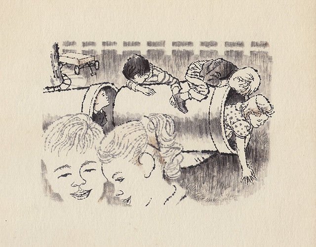
Canadian Homes Magazine was full of ideas for the family. “Backyard Fun for Youngsters,” (1961) was a do-it-yourself article on inexpensive things for kids to play on. Drawing children was a constant requirement for illustrators.

CanHomesMag02
kids3
"Sewer pipe is great for crawling."

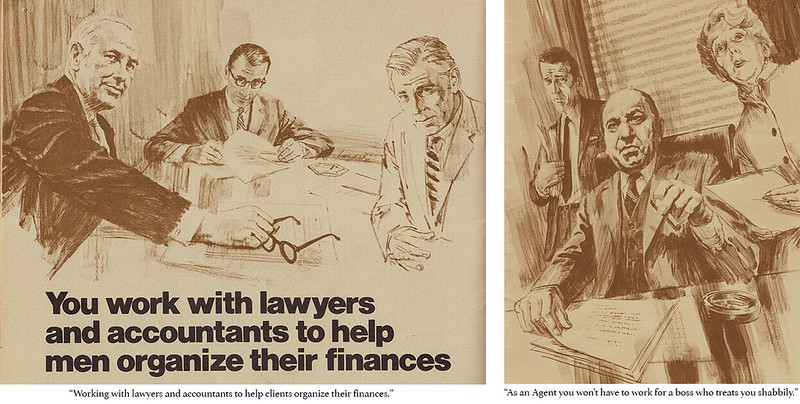
The corporate world needed illustration to embellish brochures, ads, and annual reports, to create a climate of confidence in companies of all kinds. Trade magazines had articles helping industries tackle marketing and employee concerns.

ancientplan
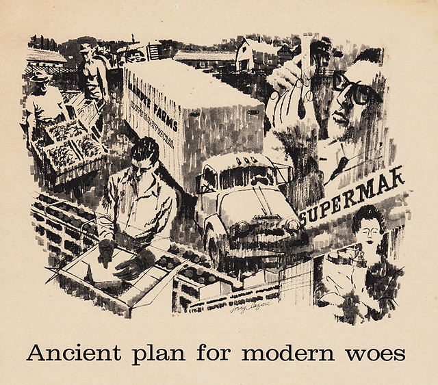
An article on growing produce, processing, packaging, and delivery to supermarkets in one illustration for Executive Magazine by Charles G. O’Neill (1961).

executiveflops
placement
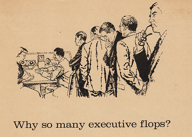
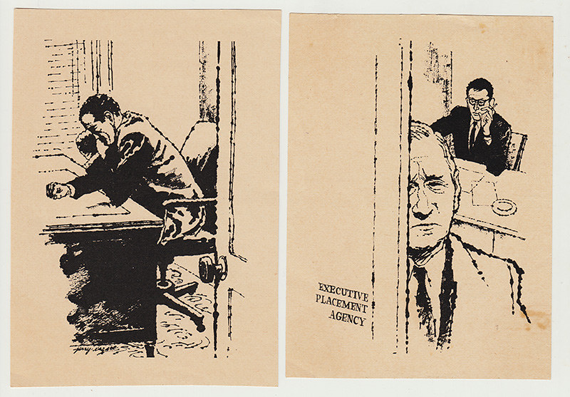
“Why so Many Executives Flop,” by Tony McVeigh, Executive Magazine (1960).

noranda
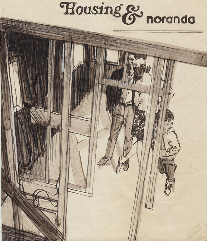
Layout for Noranda on building houses (1960’s)

EquitableLifeAssurance
From a brochure soliciting people to work as agents for the Equitable Life Assurance Society of the United States.

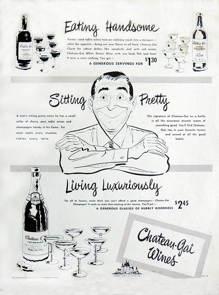
My cartooning ability was still an asset as an illustrator. Magazines often used cartoons to illustrate humorous articles and for companies to promote their products.

chateaugaiad2
A 1950s Chateau Gai magazine ad done while as an illustrator working at Bomac Engravers.

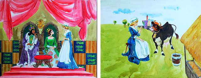
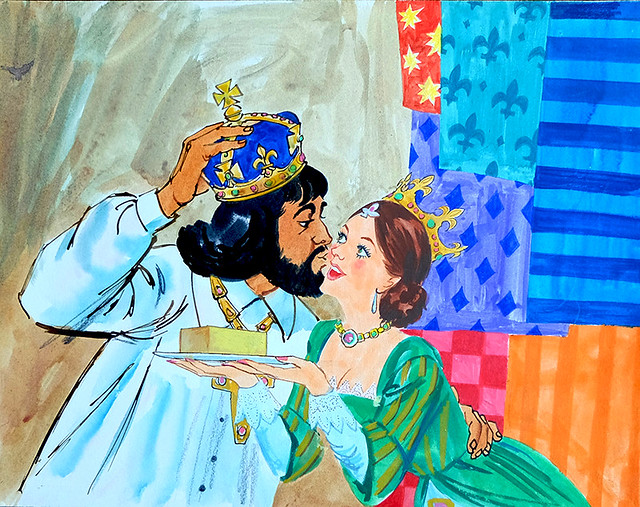
Television graphics for children’s programs were ubiquitous as well. I did numerous assignments for “The Polka Dot Door” TVO Ontario’s award winning children’s show 1971-73.

polkadotdoor
polkadotdoor2
"The King's Butter," The Polka Dot Door, TVO Ontario (c. early '70s)

4 Favourites

An artist always has a few favourite illustrations that, for some reason or other, pleased him more than others he may have done. This is very subjective and is no reflection on the rest of his work or professional competence. Four I liked especially and why.

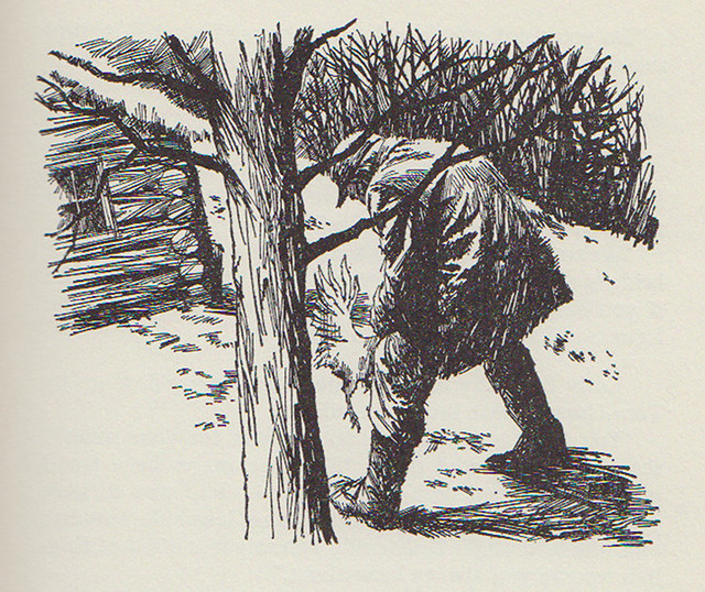
In the McClelland and Stewart book Johnny in the Klondike, two boys watch the villain strangle a chicken. The text reads “Taut with excitement, they watched in horror as the man took the chicken deftly by the neck and gave a quick twist.” This was a bit of a problem. Never having seen anyone actually do this, I had to visualize it. I had a friend act it out minus the bird, which I added later. The arch of his back hid the poor chicken with one leg and tail feathers telling the story and solving a difficult problem. The tree places the boys and reader the right distance from the act.

k2a1
Johnny in the Klondike, McClelland and Stewart Ltd., 1964

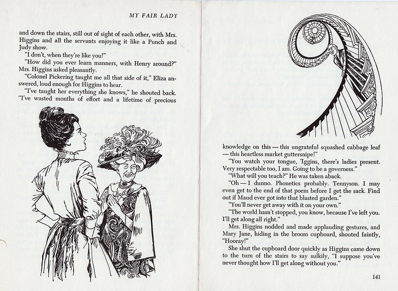
When you’re given a story like My Fair Lady to illustrate, you tend to be a little more focused. The likes of Lerner and Loewe and their adaption from George Bernard Shaw’s Pygmalion challenges you to do your best. Edwardian fashions and the elegance of the plot and charm of the two lead characters Eliza and Professor Higgins are irresistible for any illustrator worth his salt.

lazmflp140-1
My Fair Lady, Four Winds Press, 1967

The final illustration in the book with Eliza and Higgins’ mother plotting to bring him around involved a row with Higgins at the top of a winding staircase shouting down on the two below. By putting Eliza and the mother at the bottom of the left page and Higgins at the top of the right, shouting down across the two pages, I created a feeling of the actual space described in the text.
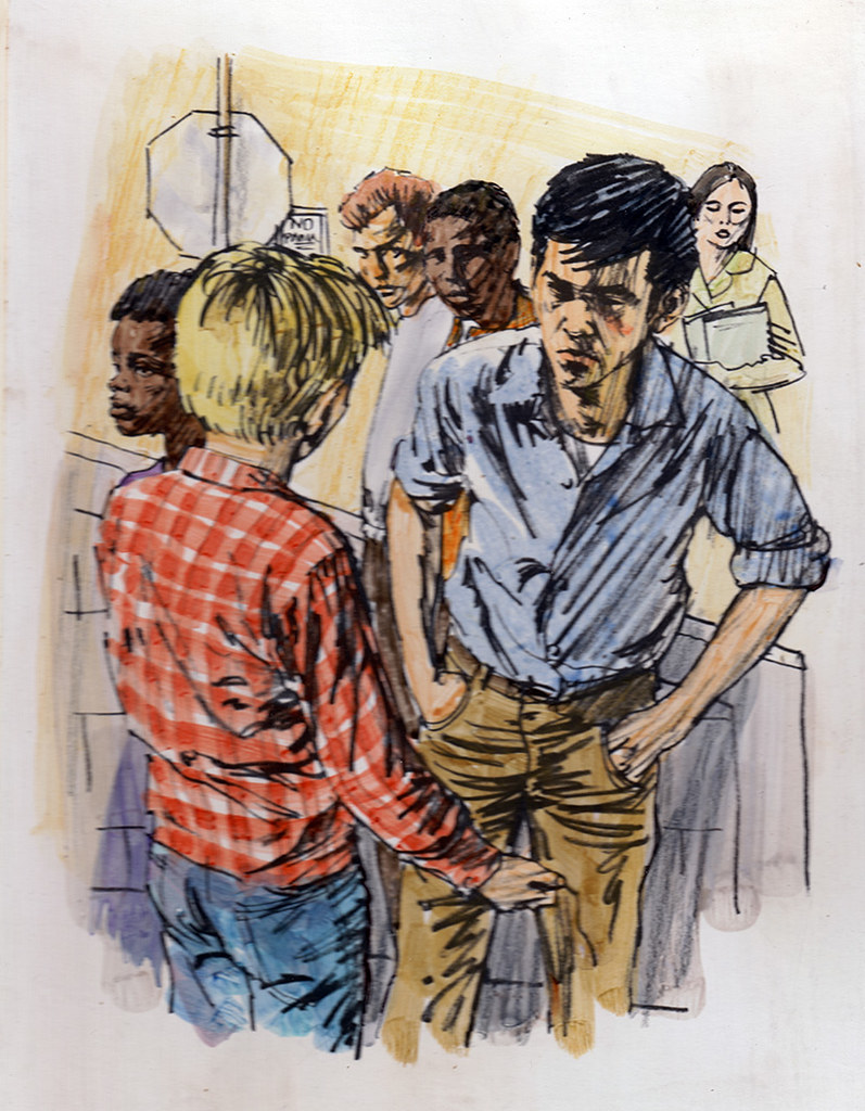
Another assignment from Scott Foresman and Co. was a story called “The Squealer.” It was about a young boy accused of squealing on a very tough gang member who is looking for him to administer revenge. He is approached by the very angry boy in front of his high school and has to plead innocence and convince his adversary. It is the pivotal illustration in the story. After sketching the two boys arguing, I added two other students hearing the commotion and looking over in a concerned way. I felt it added an element of sound to the picture and brought the picture out of the ordinary. I only have the sketch okayed and returned by the publisher for finish. I never did see the published finished art and would love to.

101

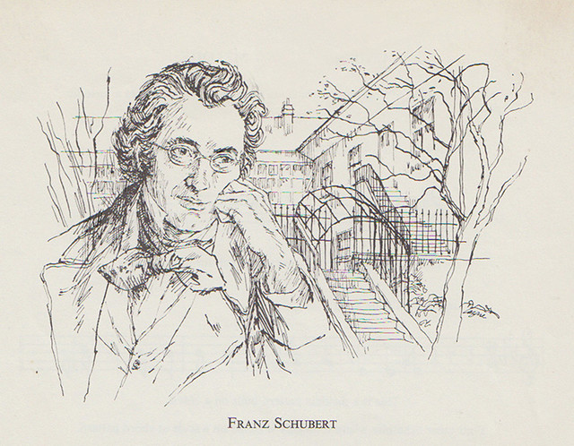
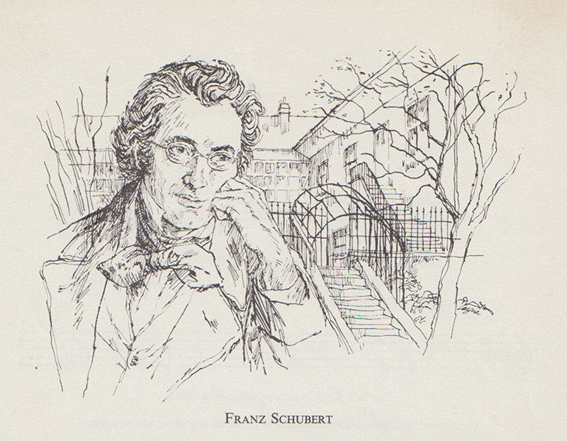
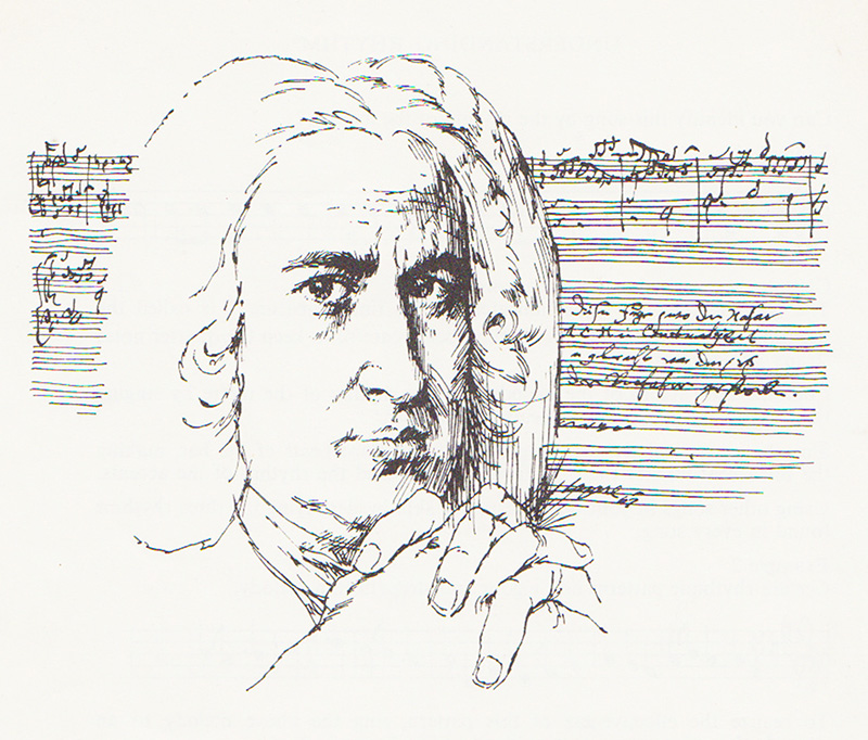
Crosshatch came naturally to me and I’ve always liked things lyrical. The portrait of Fanz Schubert falls into this category. I like it because of its style and mood.

shubert1

When I was barely a teenager, I saw the work of European painters who were great draughtsmen. Edgar Degas, Antoine Watteau, and Augustus John who attended the Slade School in London that stressed drawing in its curriculum. Edmund Sullivan, the great English illustrator and Charles Dana Gibson, the American, were also early favourites whose work I studied assiduously.

I look back on my 20 years as an illustrator fondly and with great memories. It seemed to go so quickly and when my peers awarded me CAPIC’s Lifetime Achievement Award in 1995, I couldn’t have been happier. Since then I’ve been painting pictures for myself for over 35 years, but each picture, whether it be the comics, illustration or fine art has taken me to another place away from the ordinary world into the wonderful possibilities of the imagination.

Next: From Illustrator to Painter (The Final Step)

Wednesday, August 12, 2015

An Illustrator’s Story – Magazines and Newspapers (Part I)

By Gerald Lazare

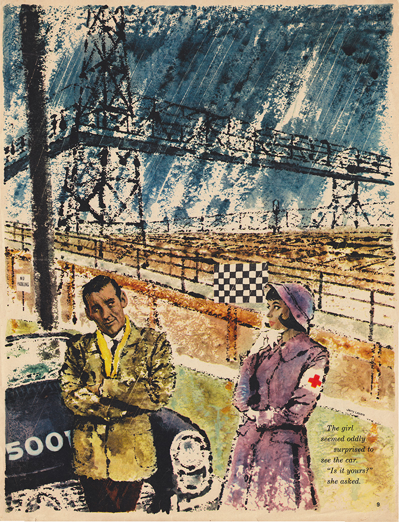
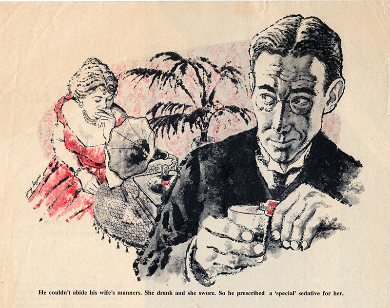
In the 50’s and 60’s magazines flourished. Television had made its entrance but the print medium still remained strong with lots of fiction and articles to make pictures for. A challenging mix of love stories, westerns, crime drama, business, travel, politics — you name it, needed stand-out graphics that would catch the eye.
lazthegirl
“Blind Spot,” by John Rhodes (1962)

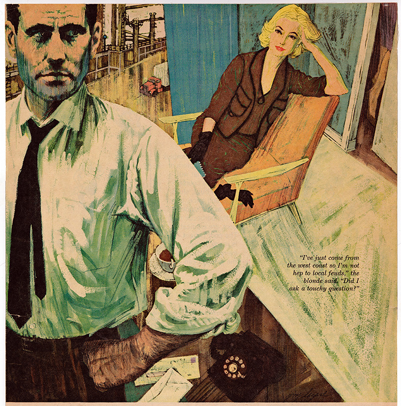
Many new trends and styles came and went and art directors would often demand new directions and expect you to work in a number of styles.

Star Weekly Illos02

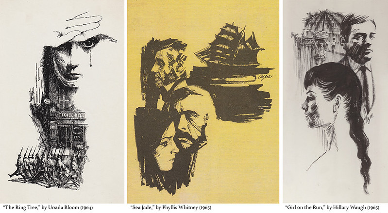
One Art Director who kept my phone humming was Ron Butler with a great smile and easy manner. He was Art Director at The Star Weekly and The Star Weekly Novel, a section of the paper dedicated to fiction. Many great writers had a vehicle for their prose in novella form and they all needed black and white illustrations to embellish them.

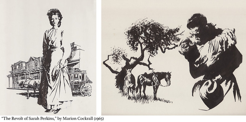
Sarah Perkins

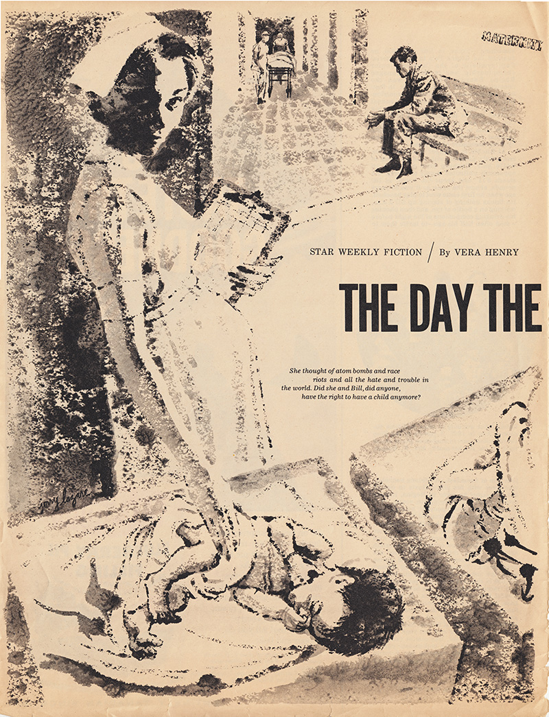
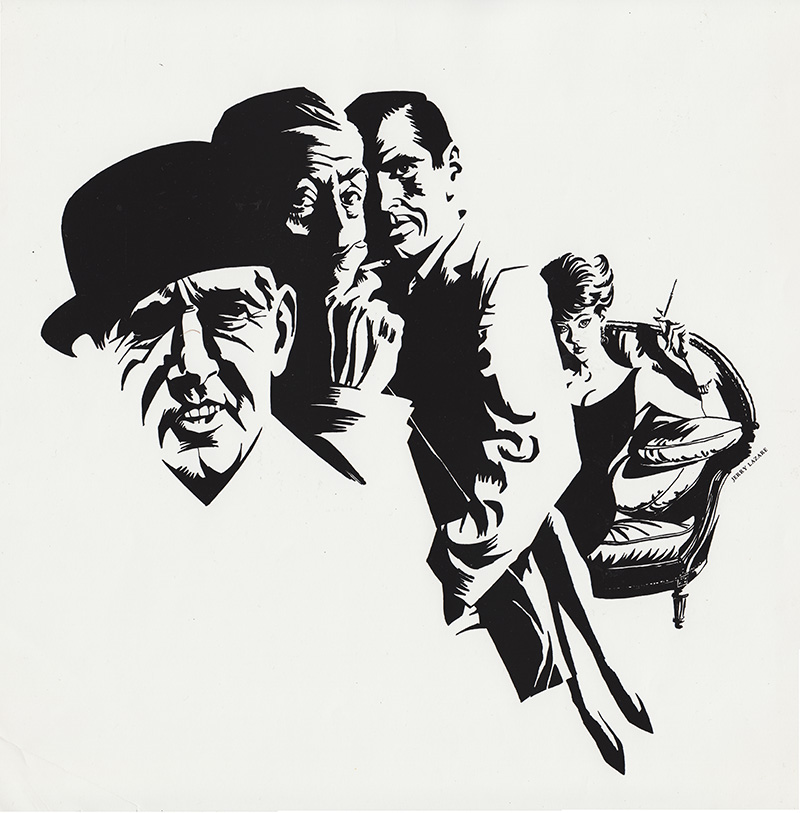
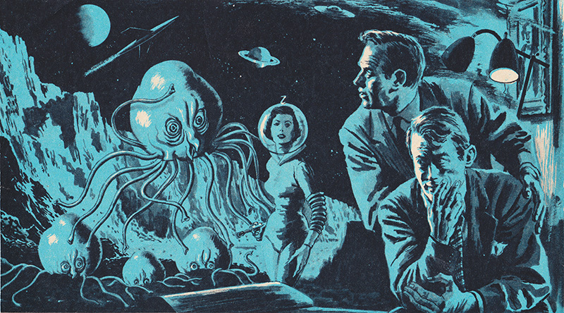
I did many of them for Ron (which you can see both above and below), as did most of the top illustrators of the day. I loved reading the story and choosing a scene to draw and bring the characters to life. Unfortunately few newspapers or magazines contain fiction today. Here are a few more of the Star Weekly illustrations I did for novellas:
lazmadmen2
“Like with a Preacher,” by Ross Annett (1964)
laznurse
“The Day the Bell Rang,” by Vera Henry (1962)
lazbowler
“Final Judgment,” by Pamela Barrington (1964)

Liberty Magazine, owned by flamboyant entrepreneur Jack Kent Cooke, specialized in articles on Canadian crime, Hollywood gossip, disasters, and often paradoxically enlightening stories on Canadian history by Frank Rasky, who also art directed. The Canada policy was highlighted by city names in their titles, such as: “The Vancouver Killer who Trusted his Wife,” “Curious Case of the Murderous Halifax Doctor,” or “Montreal Darling, Cheating Honeybunch, I’ll Murder You.”

lazpsychiatristpeck
“The Psychiatrist who Caught his Patient’s Craze,” by Dr. Robert Linder (Liberty Magazine, 1956)
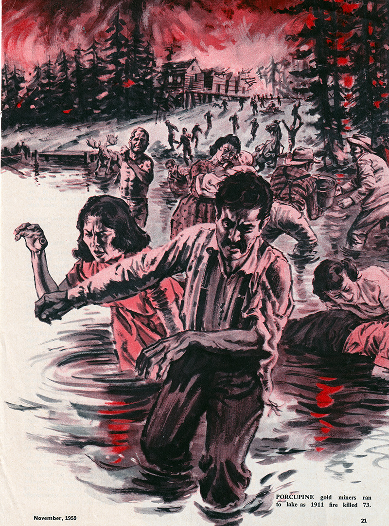
lazfire
“Ontario’s Two Wildest Forest Fires,” by Frank Rasky (Liberty Magazine, 1959)

Hugh Garner, the legendary writer wrote for the magazine and I met him at Liberty Magazine while delivering work, in the same way I met Pierre Berton at publishing houses. When I look back one of the advantages of being a freelance illustrator was all the interesting accomplished people one gets to meet when delivering your work to the offices of clients. Some of them become friends and enrich your life in myriad ways.

lazhalifaxdoctor
“Curious Case of the Murderous Halifax Doctor,” by Alan Hynd (Liberty Magazine, 1960)

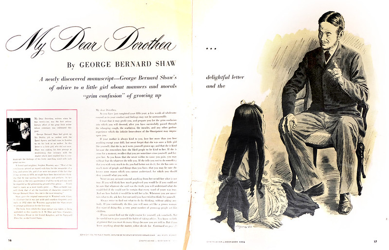
A constant dilemma of being an illustrator is the transition from your original art to the reproduction. Your audience never sees the original, but only it’s reproduction on the page.

lazshawfull
“My Dear Dorothea,” by George Bernard Shaw (Chatelaine Magazine, 1956)

Before the digital revolution, technicians working on a press with inks, paper, and plates, would pull proofs prior to reproducing your art. The Oxford Dictionary definition of ‘proof’: “printing a trial impression taken from type or film used for making corrections before final printing.”
lazbooks
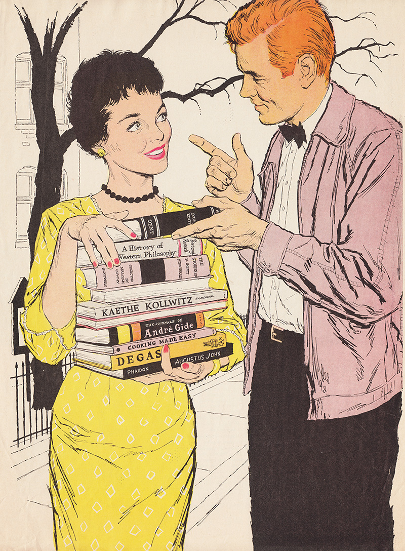
“Yellow, Yellow, Catch a Fellow,” by Margaret Flynn (Canadian Home Journal, 1957)

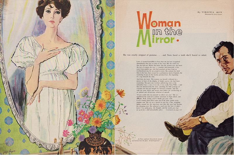
Depending on many factors, but mostly the skill and dedication of the technicians, the reproduction could be very true to your original or a mess that would make your heart drop. Often it fell somewhere in between.

womaninthemirror
“Woman in the Mirror,” by Virginia Akin (1959)

tiethatbinds1
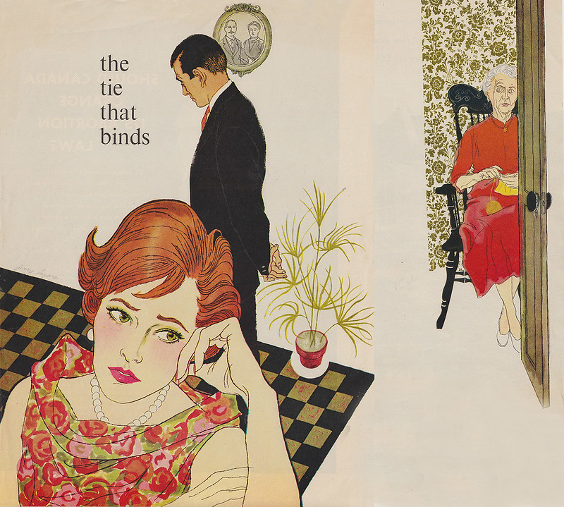
“The Tie that Binds,” by Loretta Burrough (1959)

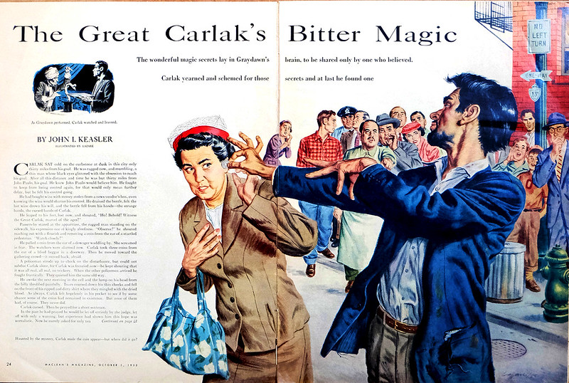
It depended on the art director to okay the proof and thus the final reproduction. One art director who cared about quality was Gene Aliman at Maclean’s Magazine. He was a no-nonsense, serious perfectionist. I often saw on his desk proofs from the painter marked with hundreds of written corrections for the printer to follow. Below is a very early illustration done in 1955 for Maclean’s Magazine. It showed my love for Albert Dorne’s work. His style was very animated with a strong line approach and washes of coloured inks floated on top. He also was an excellent draftsman and this showed up in the way that he drew hands.
lazarecarlak
​“The Great Carlak’s Bitter Magic,” by John I. Keasler (1955)

Later, with my love of painterly illustrators and fine artists, my style became more opaque and painterly.

Continued on Friday...

ordercustompaper.com made a real revolution in the industry.

Tuesday, August 11, 2015

An Illustrator’s Story – A Life of Deadlines (Part 2)

By Gerald Lazare


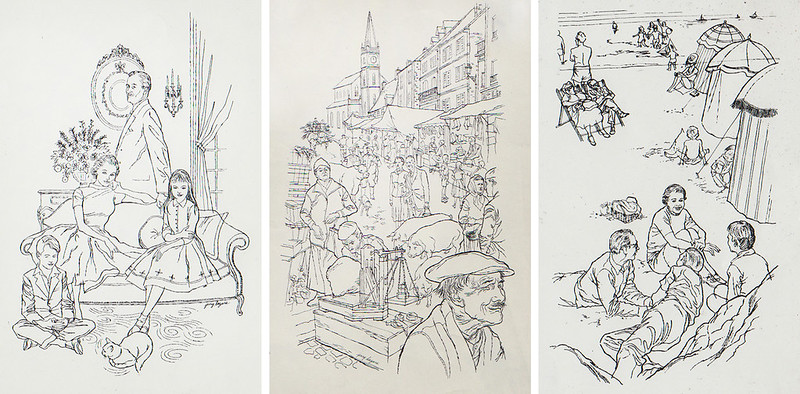
Art Directors at publishing houses usually pick the artists for a particular book. Matching the story with the right artist is very important to the success of the book. Frank Newfeld was one of the best, with a very discerning taste in both the commercial and fine arts. When he called me to illustrate the textbook Parlons Francais 1, he definitely did not want a Dick and Jane effort. All the lessons inside were skillfully worked around the activities of an upper middle class Parisian family. He wanted, as I remember, a light sophisticated style with contour drawings like Modigliani.

Parlons Francais Interiors
Parlons Francais 1 Longmans, Green & Company 1959

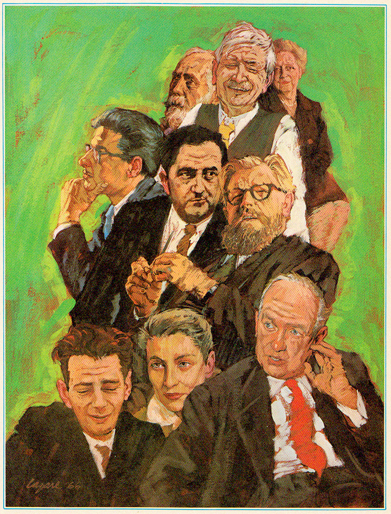
Another assignment from Frank was an anthology of Canadian writers in the Canadian Centennial Library Series by Claude Bissell. The opportunity to illustrate stories by leading Canadian authors such as Ethel Wilson, Morley Callaghan, Mordecai Richler, Robertson Davies and Gabrielle Roy was a dream job. A great Art Director can lift your reputation with lovely commissions like this.

1
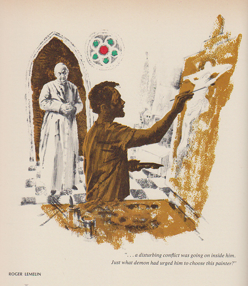
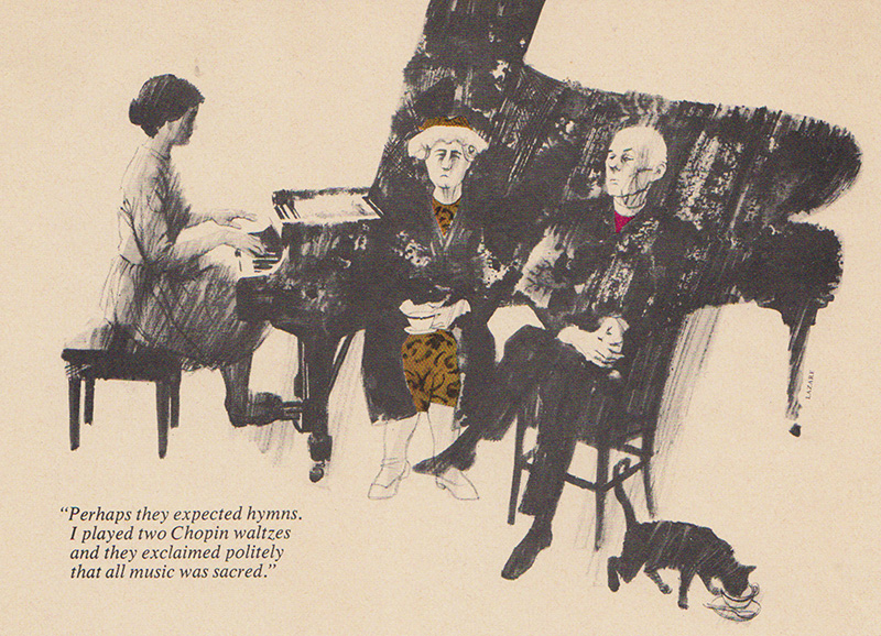
Great Canadian Writing, The Centennial Library, McClelland and Stewart Ltd. by Claude Bissel, 1966. This includes portraits of Roger Lemelin, Mordecai Richler, Gabriel Roy, Morely Callaghan, Robertson Davies, Ethel Wilson, Stephen Leacock, and Brian Moore

rogerleelin1

chopin1

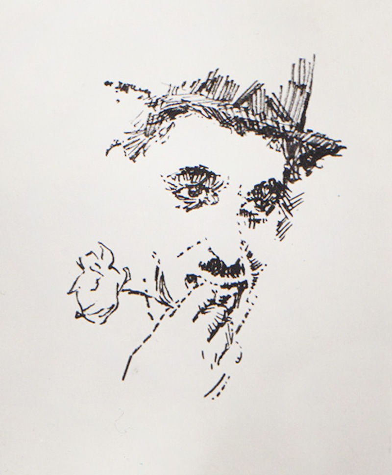
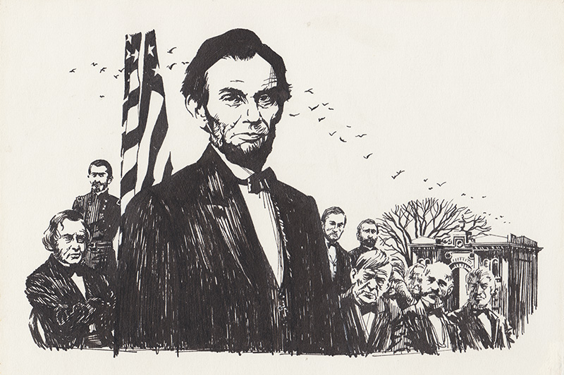
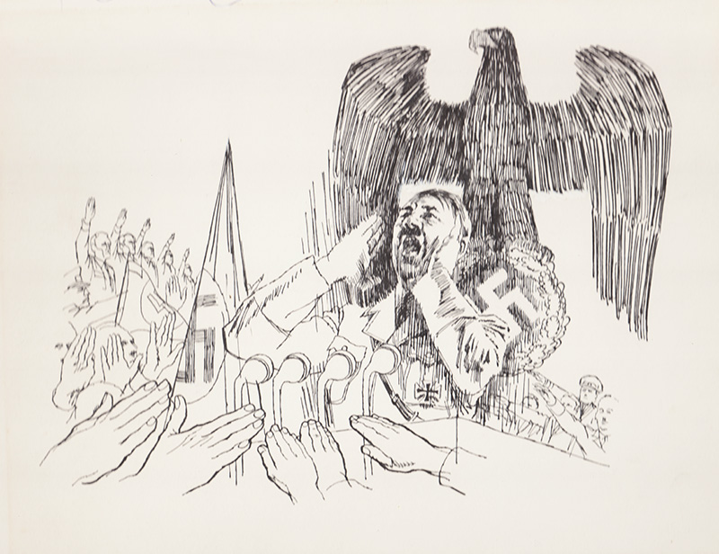
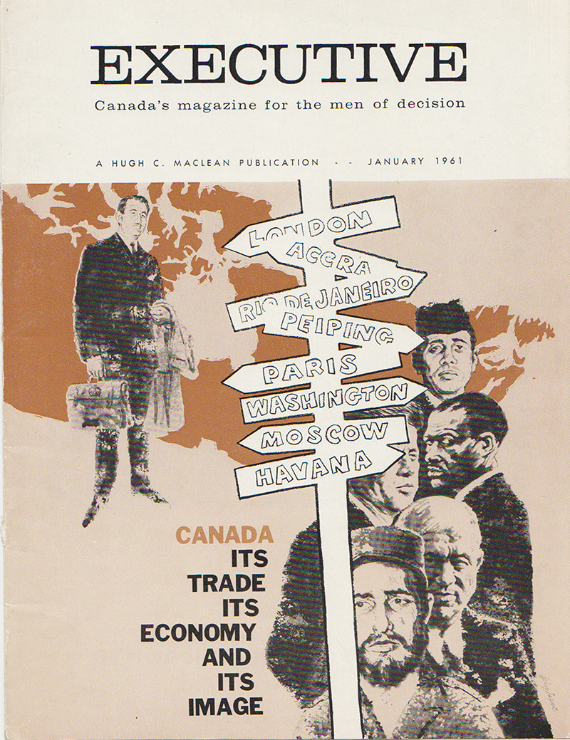
While I’m on the subject of famous people, the ability to get an exacting likeness is an essential arrow in any illustrator’s quiver and it comes up more than you might think. An early lesson in the Famous Artists Course stresses the need for reference material on famous people in politics, theatre, sports, science, music, etc., and they even supplied categories to build a system on. Now I know, as a painter who does portraits, I was helped and prepared by all the assignments I received as an illustrator. Here are a few done for various magazines, books and newspapers in the '50s and '60s:
cc1
(Chaplin)

linc4a
(Lincoln)

nazirally1a
(Hitler)

execmag1
(At the bottom you can see John F. Kennedy, Khrushchev, and Castro)

bach1
(Johann Sebastian Bach)

shubert1

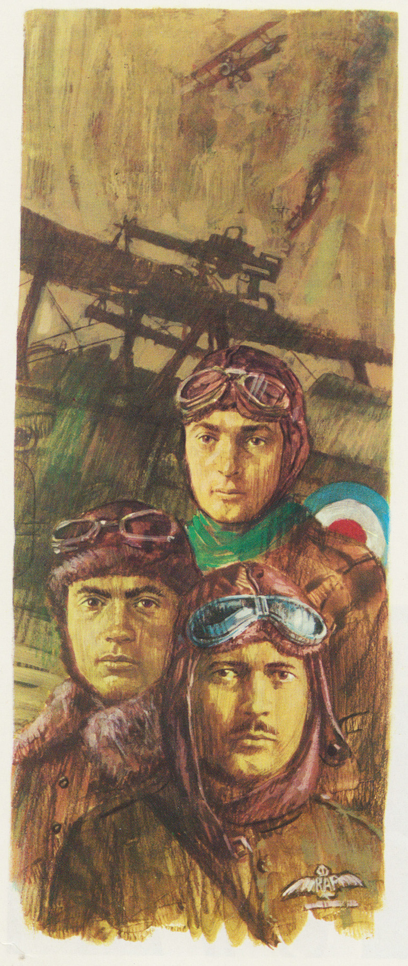
For portraits of people who are not universally well-known like the World War 1 aces below (Freddie McCall, Bill Claxton and Donald Maclaren) photos were supplied to me by the publishers.
canwaraces1

Many high school text books dealt with short stories to encourage reading and language. The stories were often about famous Canadians in all walks of life and Canadian culture in general. For the illustrator it meant a lot of research and often difficult compositions. One such book was “Outward Bound” published by the MacMillan Company of Canada in 1965.

108

A second colour done on overlays helped to enhance the work.

107

outwardbound

Sometimes a publisher will want changes. The illustrator then was nearly always required to submit sketches for approval so they could see what they were going to get.

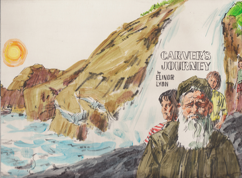
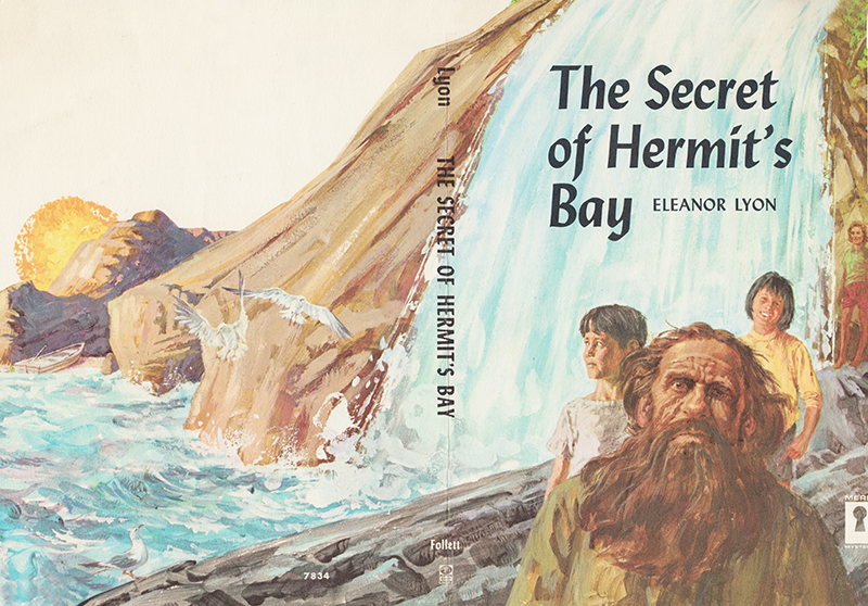
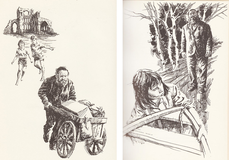
The Secret of Hermit’s Bay (1962) by Elinor Lyon from the Follett Publishing Company in Chicago was one I enjoyed because its title figure Mr. Brown was such a great anti-hero… a scruffy loner who teamed up with three kids to solve a mystery. It also had a wrap-around full colour cover that I could design myself. Mr. Brown was really an anti-hero but sweet underneath it all. On the cover I depicted him as more sweet than menacing and scruffy and the instructions that came back from the Art Director were to “Make him uglier!”

shb3
(Initial sketch sent to publisher)

I did and the cover was a big hit and as everyone knows the cover sells the book so I received many more to do.

secreifhermitsbaycov
Hermit'sBayInteriors

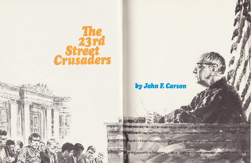
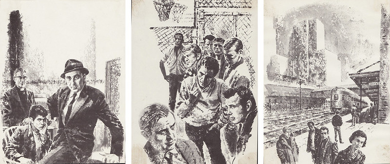
The American Melting Pot agenda required illustrators skilled in depicting urban ethnic populations, so publishers were always after that particular talent. My agent told me they thought I fitted the bill and started to send me tough city dramas like The 23rd Street Crusaders. It was the story of a street gang whose fortunes are changed by an outsider who introduces them to basketball.

23rdstcrusaders
CrusadersInteriors

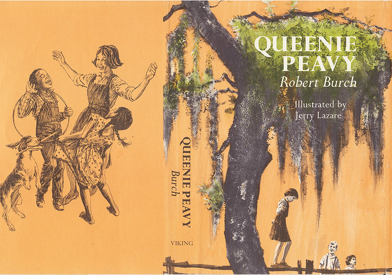
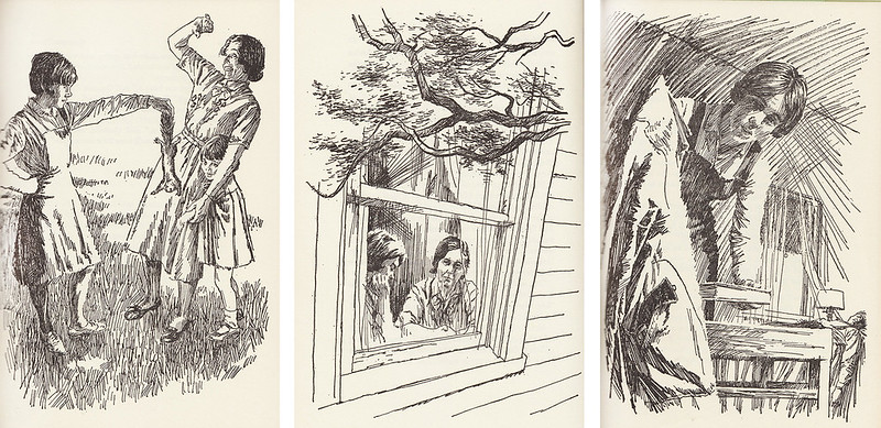
The book that gained me probably the most celebrity was Queenie Peavy (1966) by the famous southern children’s author Robert Burch. I didn’t know it at the time, but he had seen my work in Jean Little’s stories and told his publisher he wanted me to illustrate his latest book. He found me through my agent. The Georgia writer was quite famous with a string of successful award winning books but Queenie Peavy became by far his most successful and was published and re-published in many languages around the world. It won the prestigious Jane Addams Award for both writing and illustration in 1967.

queenie peavey
(Viking Press, 1966)
QueeniePeaveyInteriors

The comic strip work I did in my youth was immediately devoured by its equally young audience and I was recognized for it by many fans right away. When I started my painting career with a series of one man shows many years later in 1975, I received reviews in the major newspapers and art magazines and positive reactions from many generous collectors. But, as an illustrator you are anonymous to the public unless you have a vehicle like The Saturday Evening Post and are Norman Rockwell. Illustration receives little recognition. I think of all the extremely talented men and women of illustration who I knew and whose work I admired and followed avidly in that golden period. Attention should be paid! They should be noted and remembered in our Art History for all they did to brighten our lives.

Continued tomorrow...


Dedicated to the memory of Tom Bjarnason